Are You Fed Up With Your Website? Are You Getting Any Leads or Sales? Is Your Website An Eyesore And It Is Not Representing Your Company Properly?
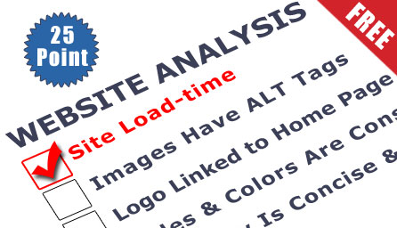
“Why is my website NOT doing a darn thing!!! It’s not helping me with Sales and Generating Leads!”. Have you ever said that about your website? If so, we can help you like we have helped hundreds of other website owners over our 11 years of being in business. As a perspective customer, we want to give you a FREE 25-Point Website Analysis with Expert Advice.
Our customer engagement begins with a free website review with one of our senior web consultants. It's the best way to get the "lay of the land" in addition to starting a long term business relationship. The more we know about you, the more return you'll see from your investment with us.
What's included?
We will review your site’s “Accessibility”, which are things like, site load-time, text to background contrast, font size and spacing is reasonable, flash and add-on review, images have proper ALT tag labels, and that your site has a custom not found page.
We will review your site’s “Identity”, which are things like, company logo and tag line are displayed properly, home page is reviewable with in the 5 second rule, clear path to company information, and company contact information.
We will review your site’s “Navigation, which are things like, easy to use main navigation, labels are clear and concise, reasonable number of links and buttons, logo is linked to the home page, easy to identify links, and site search is easy to access.
We will review your site’s “Content”, which are things like, review of the major headings, critical content is above the fold, style and color are consistent, review emphasized text, review ads and pop-ups, concise and clear copy, link names are meaningful and user friendly, and page titles are ideal for search engine visitors.
We will then offer our professional advice about your website and what we would do to improve it to meet your business goals.
Here are the details of what we will cover:
Accessibility
We will review not only traditional accessibility issues, but anything that might keep a visitor from being able to access the information on your website. If no one can load your site, or the font type is too small to read, all of the usability in the world won't matter.
1. Site Load-time Is Reasonable
If a site takes forever to load, most people will just leave. Many of us do use high speed internet now days, but that makes our patience even thinner.
2. Review Text to Background Contrast
Dark gray on light gray may seem stylish, but users will not ruin their eyesight to read your website text. Eyes and monitors vary wildly, so keeping your website’s core copy contrast high is very important. Good, old-fashioned black-on-white is still best most of the time.
3. Font Size and Spacing Is Easy to Read
Opinions vary on the ideal size for text, but err on the side of slightly too big. Poor readability increases frustration, and frustration leads to site abandonment. We will review your line spacing is adequate – white space is your readers best friend.
4. Using Flash & Add-ons Sparingly
No matter how great your site looks, people won't wait more then 5 seconds for a website to load. Some new technology needs to be used sparingly and used ONLY when it really enhances your goals. Using basic website designs are a plus for search engines.
5. Images Are Labeled Properly
Not only do sight-impaired visitors use the image labels, but search engines need them to understand your images.
6. Review Your Custom Not-found Page
If a page on your site doesn't exist, a white page with "404 Not Found" page will display. This is a great way to lose a customer, which we are assuming is NOT one of your goals.
Identity
It is key that your potential customers know "Who you are". It's important to answer this quickly, and answer the obvious follow-up questions ("What do you do?", "Why should I trust you?", etc.) clear.
7. Prominently Placed Company Logo
Your logo or brand needs to be easy to find, and that usually means the upper-left of the screen. People expect it there, and they like it when you make their lives easy.
8. Clear Company Tagline
Answer "What do you do?" concisely with a descriptive tagline. Avoid marketing jargon and boil your unique value proposition down to a few words. This is also a plus for SEO.
9. Home-page Is Viewable Within 5 Seconds
There's some disagreement over just how many seconds a website has to grab a visitor. Some have the basic 5 second rule. Website visitors are very sensitive, and they need to get the basic idea of your home-page in just a few moments.
10. Clear Link to Your Company Information
People need an easy and fast way to learn more about you. Most people label this page "About Us". This may seem boring, but confidence is important on the web, and they need to learn about your story.
11. Clear Link to Your Contact Information
Quick access to your contact information is very important for your clients and potential customers. It is also important for the search engines, including local searches.
Navigation
Once people generally know who you are and what you do, they need clear paths to the content that interests them.
12. Easy to Use Main Navigation
Every site on the web has a main navigation. We will review it to make sure it is easy to read, and use. If you have two or more navigation areas, we will review those as well.
13. Clear & Concise Navigation Labels
Your main navigation should be short, to the point, and easy for anyone to grasp.
14. Reasonable Number of Buttons/Links
There are different thoughts in the website industry on how many main navigation links are reasonable, if you start to get past 7 menu items, you may want to think hard about whether you need them, or not.
15. Company Logo Is Linked to Your Homepage
This may sound minor, but people expect logos to link to homepages, and when they don't, confusion and frustration follows.
16. Consistent & Easy to Identify Links
Links need to stand out, and you should use them sparingly to not disrupt your content. The underlined, blue link has always been a part of the web. Little artistic graphics are acceptable as well.
17. Easy to Access Site Search
If you have a site search, make sure it sticks out. Most users tend to prefer the upper-right corner of the website page. Keep the button simple and clear - "Search" still works best for most sites.
Content Is King
You've heard it before that “Content is King”. If you don't want your kingdom to crumble then you need to make sure you have good content your visitors want and that is consistent, organized, and easy to skim through. PLUS, it is good for the search engines.
18. Clear & Descriptive Major Headings
Most people don't read online, they skim. Use headings (major and minor) to set content apart and keep it organized.
19. Critical Content Is Above The Fold
The "fold" is that imaginary line where the bottom of your screen cuts off a page. Content can fall below the fold, but anything critical to understanding who you are or what you do (especially on the home-page) should fit on that first screen.
20. Consistent Styles & Colors
Layout, headings, styles and colors should be consistent site-wide. Don't use red headers on one page, red links on another, and red text somewhere else. Confuse them and you'll lose them.
21. Use Emphasis Sparingly (bold, italics, etc.)
Draw attention to everything and you'll effectively draw attention to nothing. We've all seen that site, the one with a red, blinking, underlined "NEW" next to everything. Don't be that site.
22. Unobtrusive Ads & Pop-ups
Since ads are a fact of life, integrate them nicely into your site, and make sure they are clear. Don't force ads and pop-ups down. If you blur the line between ads and content too much, your content may suffer.
23. Make Sure Your Main Copy Is Concise
Look at your home-page - can you say the same thing in half as many words? Be concrete and descriptive and avoid jargon - nobody cares if you can "leverage your synergies".
24. Meaningful & User-friendly Links
Meaningful keyword-based links are generally good for both visitors and search engines, make them descriptive and friendly.
25. Descriptive Page Titles
Page titles are the first thing search engine visitors see. If the titles don't make sense or look spammy, the search engine will move on to the next result. Your page titles should be descriptive, unique, and not jammed full of keywords.
No Spam*Important: We HATE spam as much or more than you do and will not rent, share, or sell your information with anyone ever! We will only use your information to communicate with you directly, and you can remove yourself from our list at any time.

 No Spam*Important: We HATE spam as much or more than you do and will not rent, share, or sell your information with anyone ever! We will only use your information to communicate with you directly, and you can remove yourself from our list at any time.